Sugar Free festive campaign
Anmol
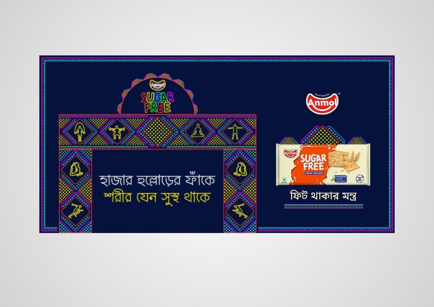
A Durga Puja gate and pack lockup in Bengali, built so the health claim reads at pandal distance rather than at arm's length.
The build portfolio
Packaging, press, identity, campaign, social and web — every piece on this page shipped for a paying client. Design work has to be looked at, so the images come first and the caption only says what the piece had to do. No concepts, no spec work, nothing built to win an award.
[01] The reel
Keep scrolling — the track moves with you. Filter by discipline in the gallery below.
Anmol
A Durga Puja gate and pack lockup in Bengali, built so the health claim reads at pandal distance rather than at arm's length.
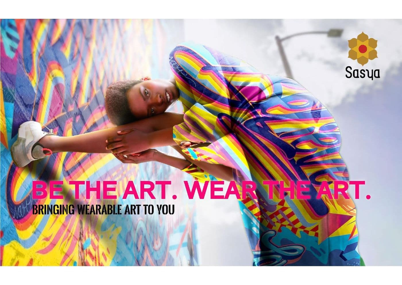
Sasya
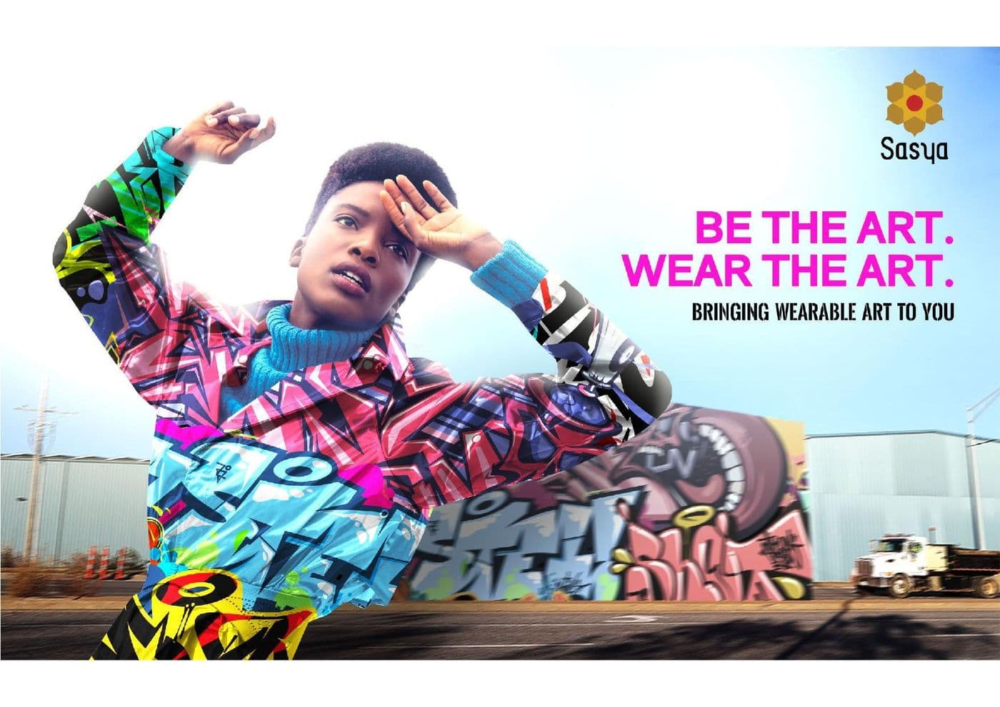
A wearable-art campaign where the garment and the backdrop are the same artwork, so the product cannot be cropped out of its own advertising.
Sasya
The hero frame for the launch, art-directed so a single image could carry outdoor, press and social without a reshoot.
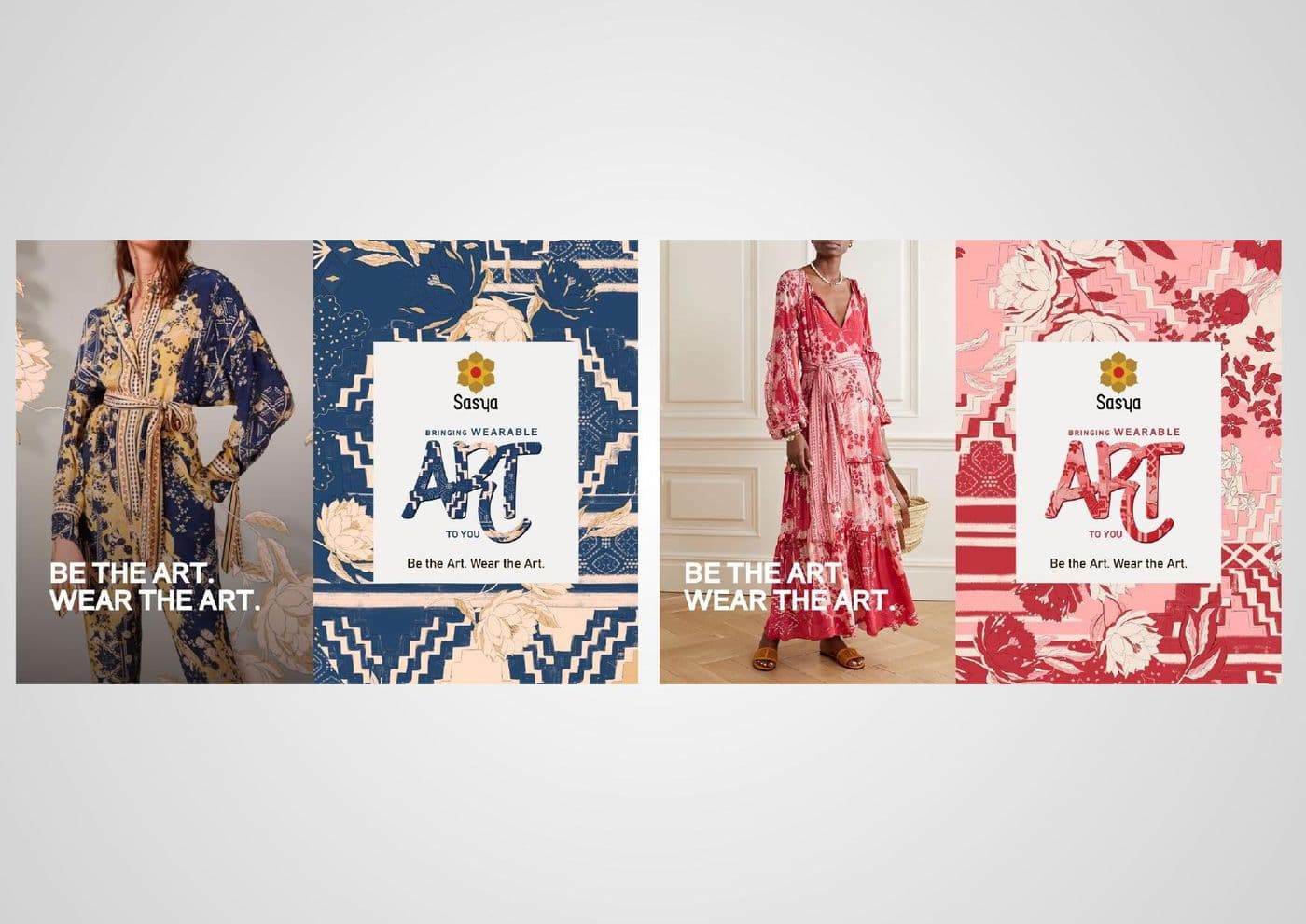
Sasya
The textile prints turned into a brand pattern library, so packaging, signage and social all draw from the same set.
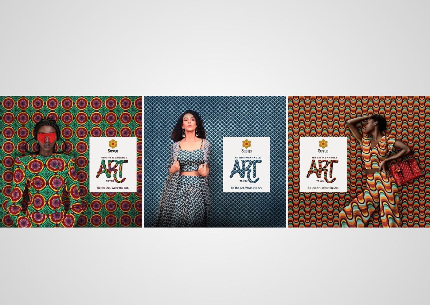
Sasya
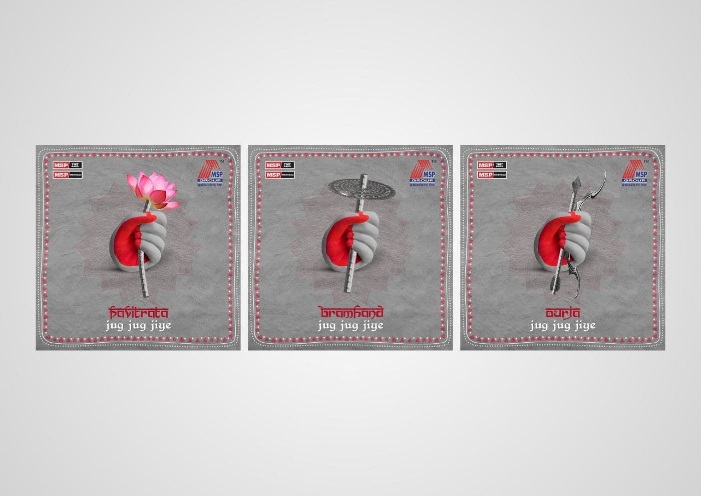
A poster run in three colourways, each holding the same lockup so the series reads as one campaign across a shopfront.
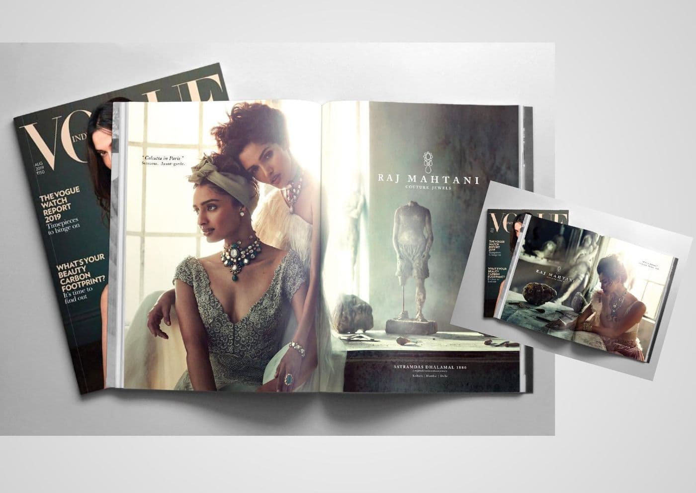
Raj Mahtani
A jewellery spread laid out for a glossy, where the typography has to stay quiet enough to let the pieces carry the page.
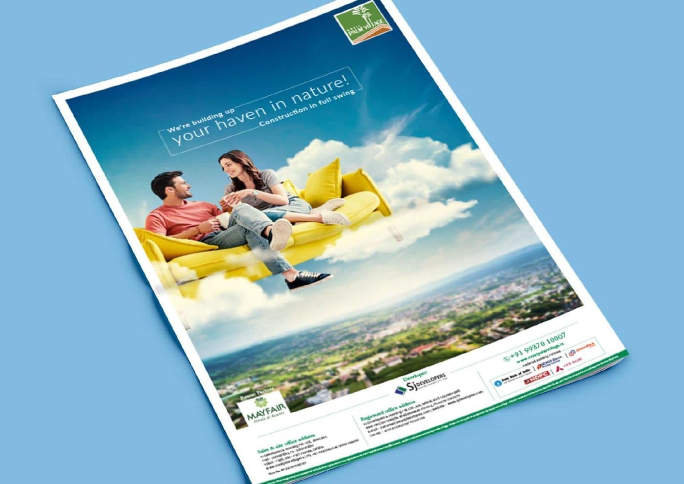
A full-page property launch built around one open-sky image, because a press ad competing with a newspaper needs air, not features.
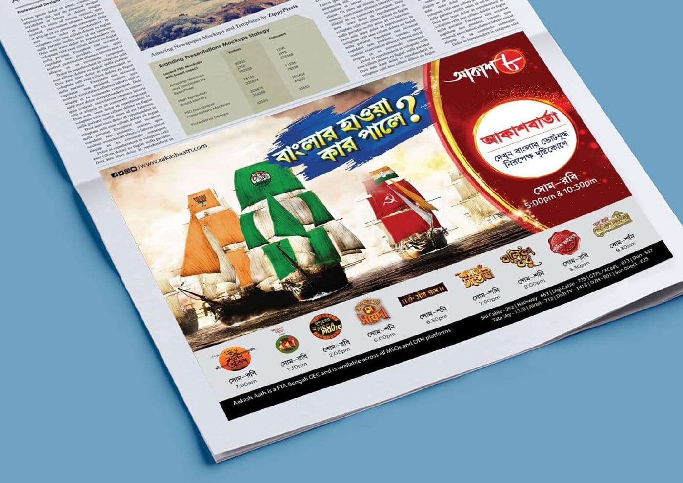
Retail press in Bengali, typeset so the offer survives newsprint dot gain and still reads at a glance.
Rajat Primarc
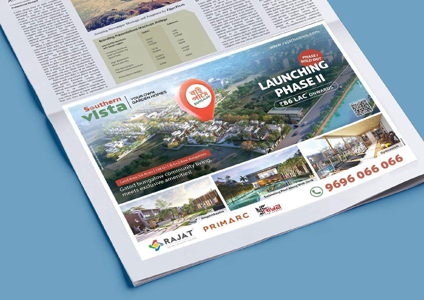
A phase-launch announcement where the price point and the phase number had to be the two things a reader took away.
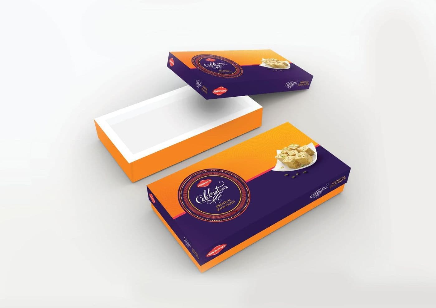
A sweet-box system in two structures and one palette, designed to stack cleanly on a counter and photograph well on a phone.
PRAN
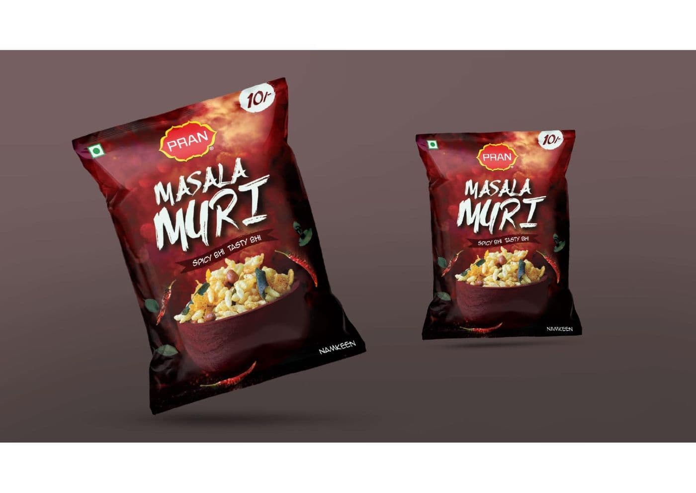
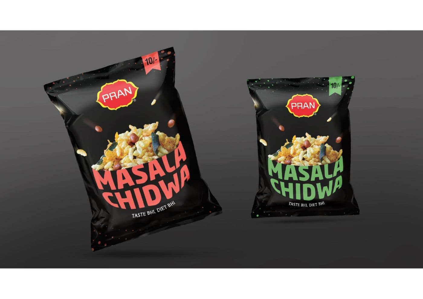
Masala Muri and Masala Chidwa packs built on one grid, so the range reads as a family on a crowded shelf.
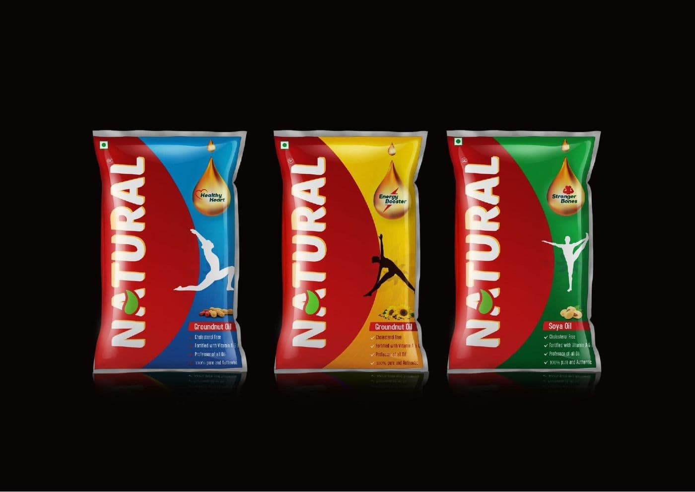
A flavour range differentiated by colour block alone, so a shopper finds the variant without reading a word.
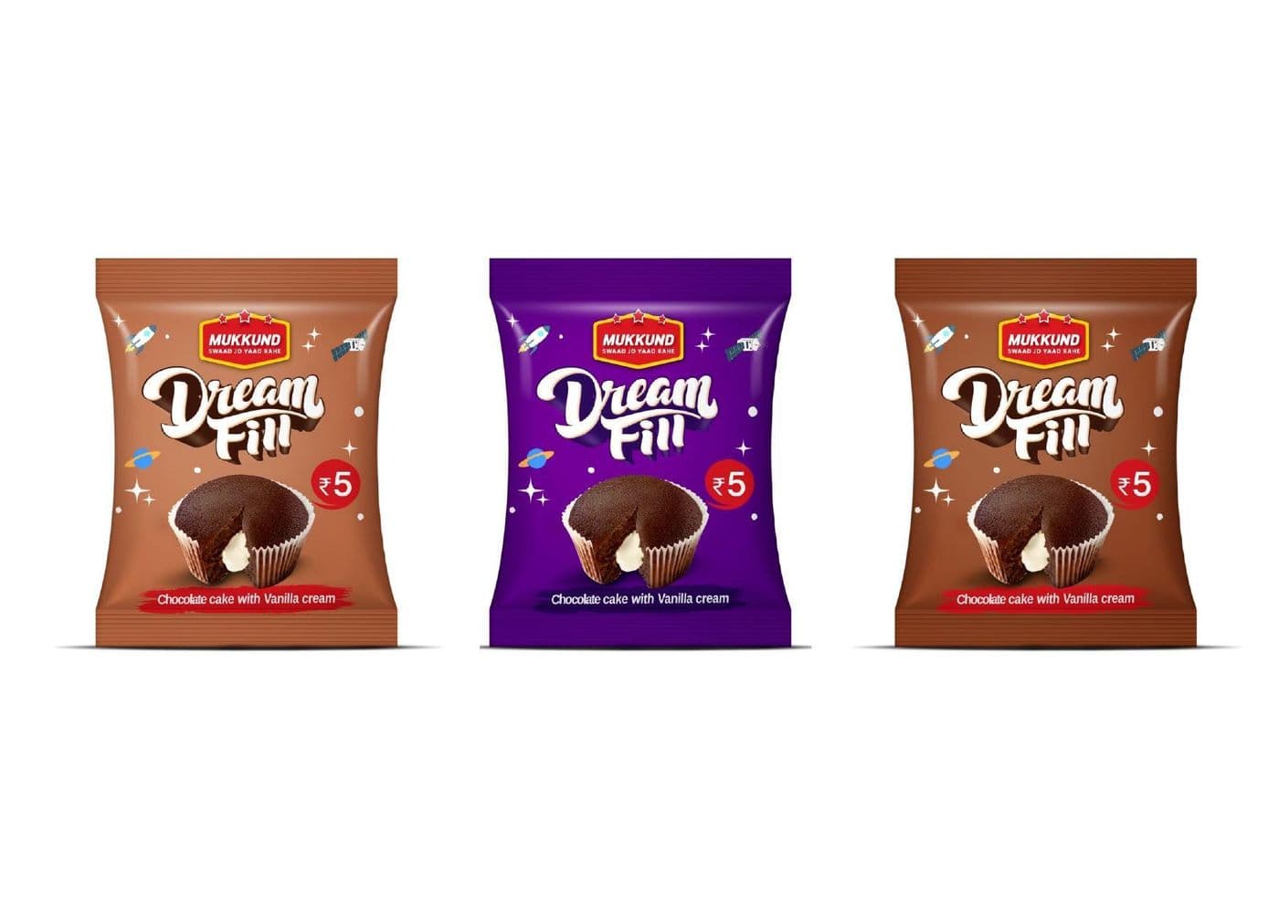
Confectionery packaging where the cutaway product shot does the selling and the type stays out of its way.
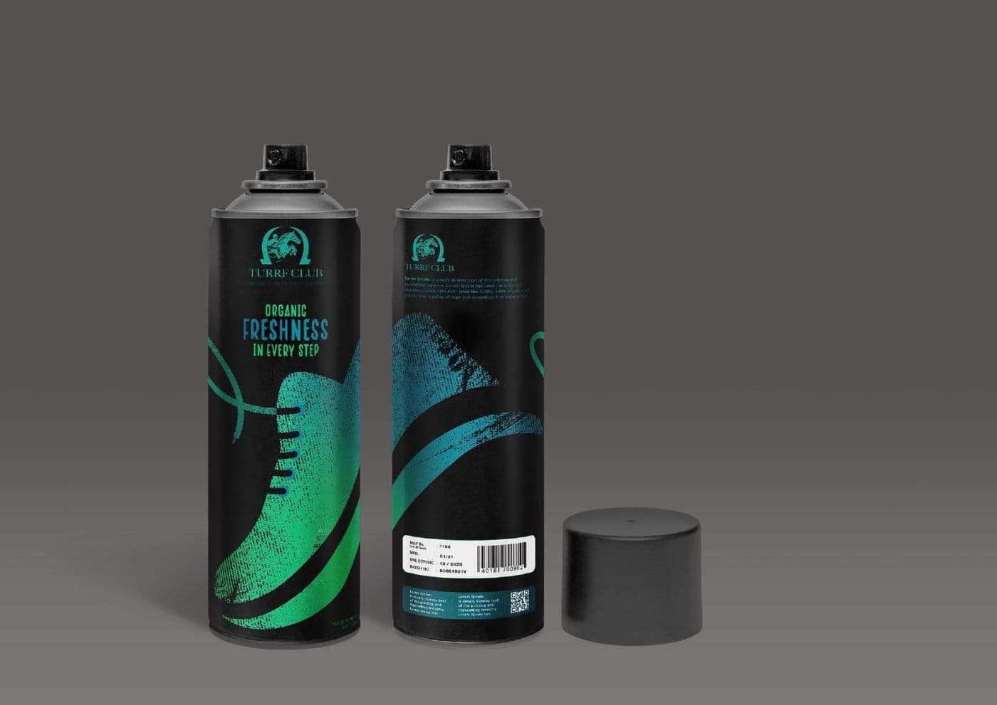
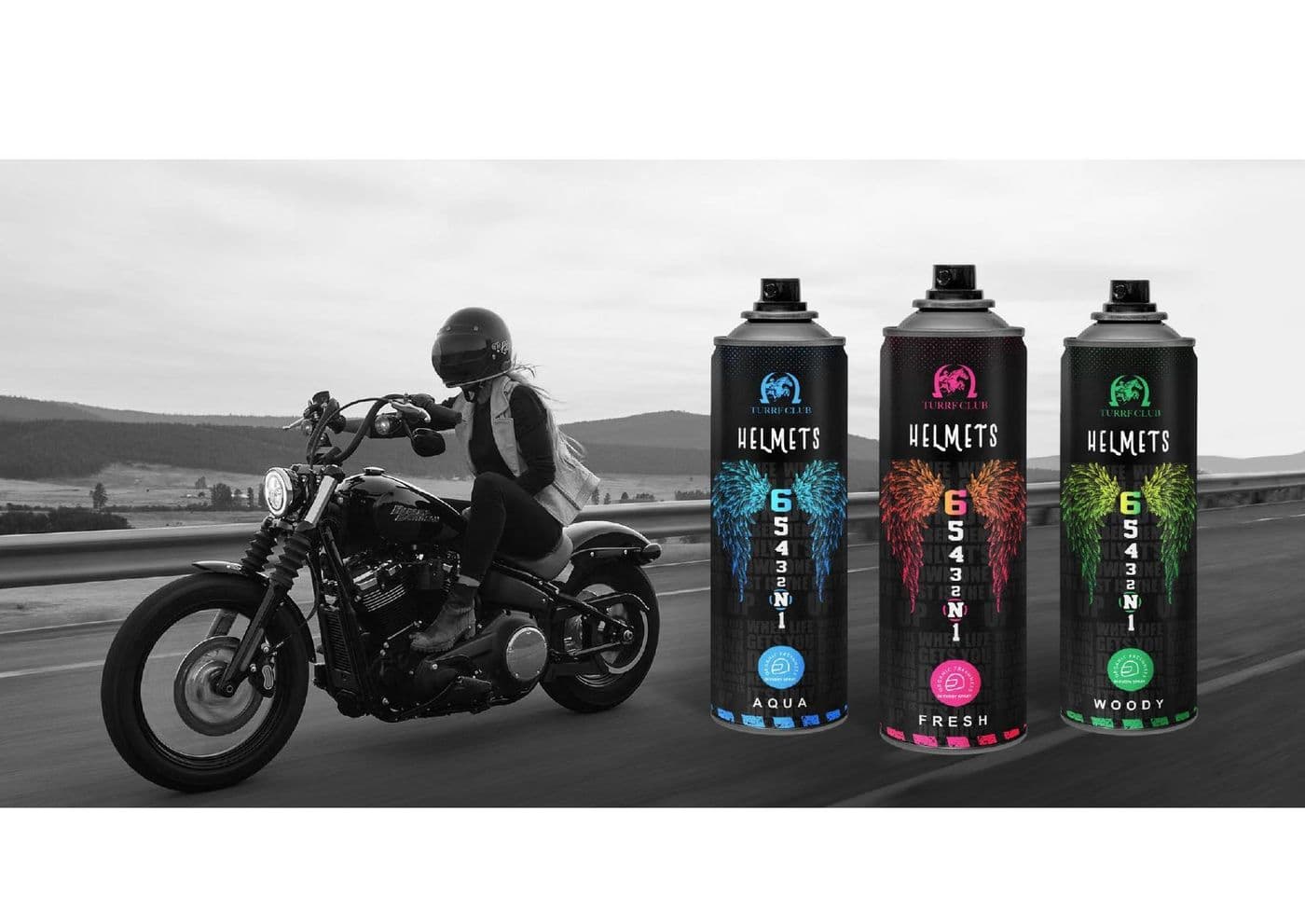
A can wrap designed on the cylinder rather than the flat, so the artwork resolves from any angle on shelf.
Product and lifestyle shot as one campaign, so the range and the reason to buy it arrive in the same frame.
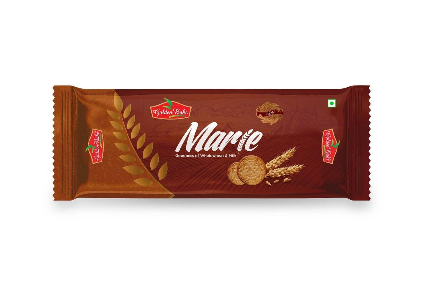
A mass-market biscuit wrapper where the only jobs are appetite appeal and legibility at arm's length.
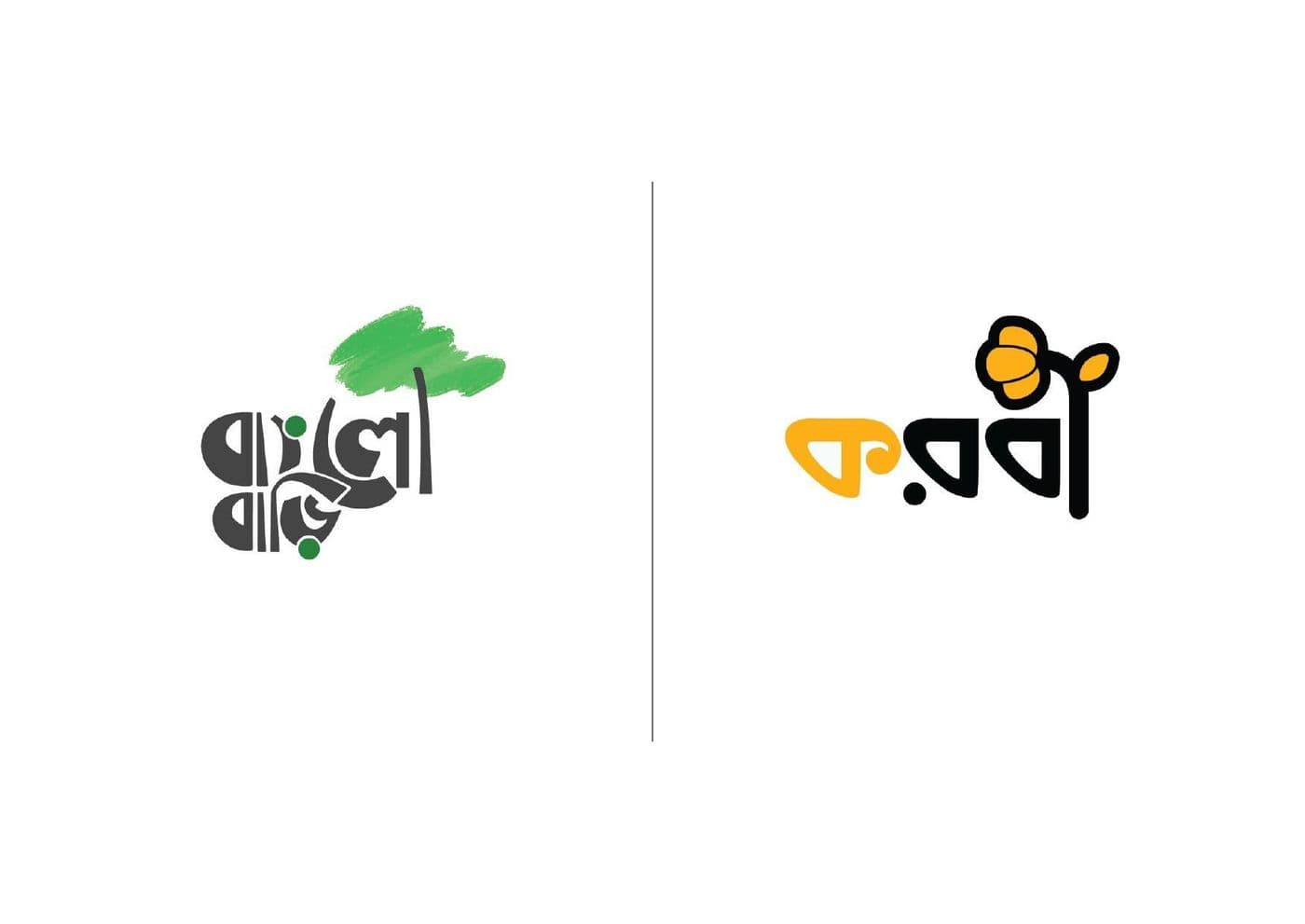
Logotypes drawn in Bengali script, where the letterform has to carry the brand because a Latin fallback will not.
Mark routes explored side by side, so the client chooses a direction rather than reacting to a single option.
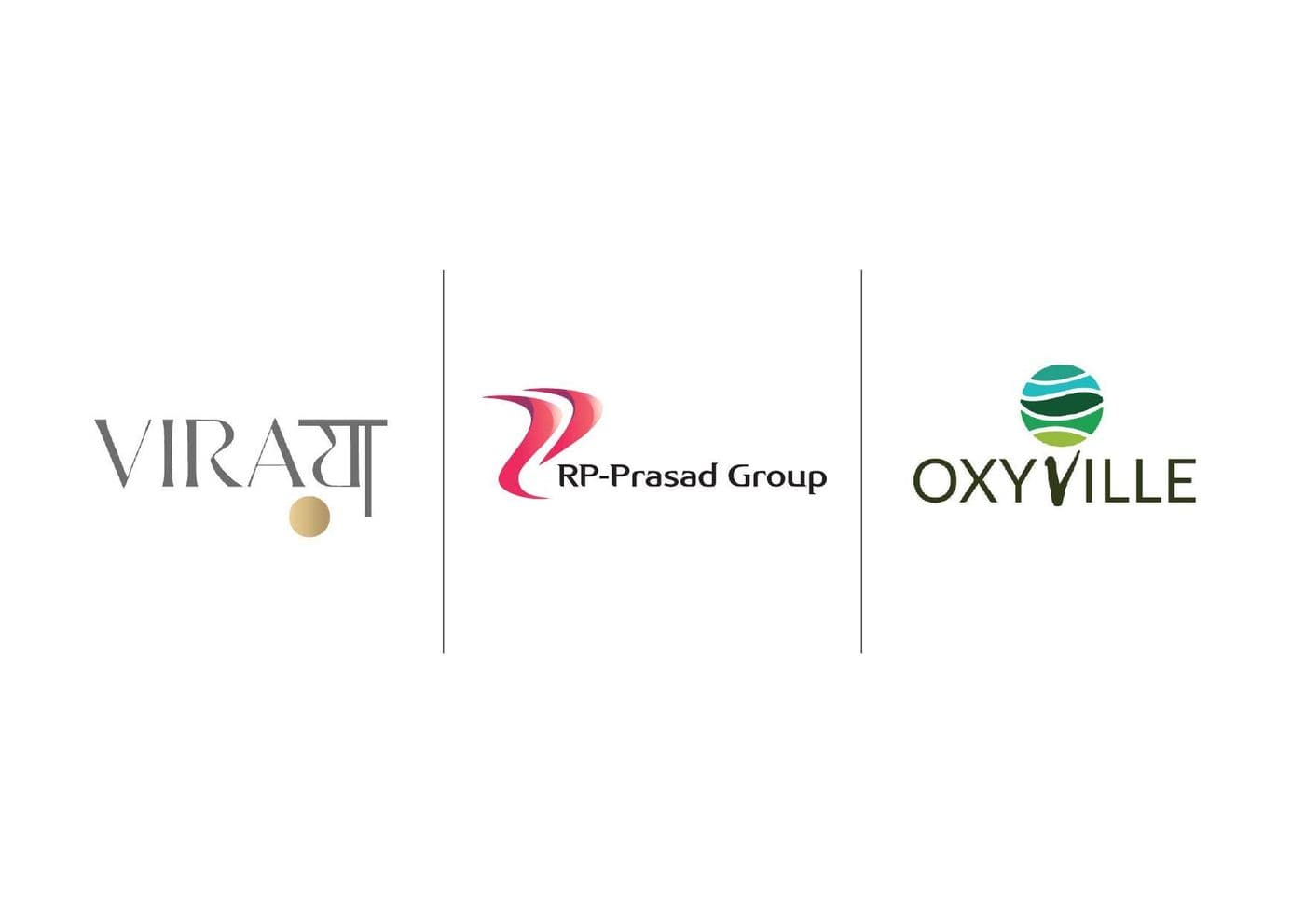
Three sibling marks for one group, drawn to sit together on a letterhead without any one shouting over the others.
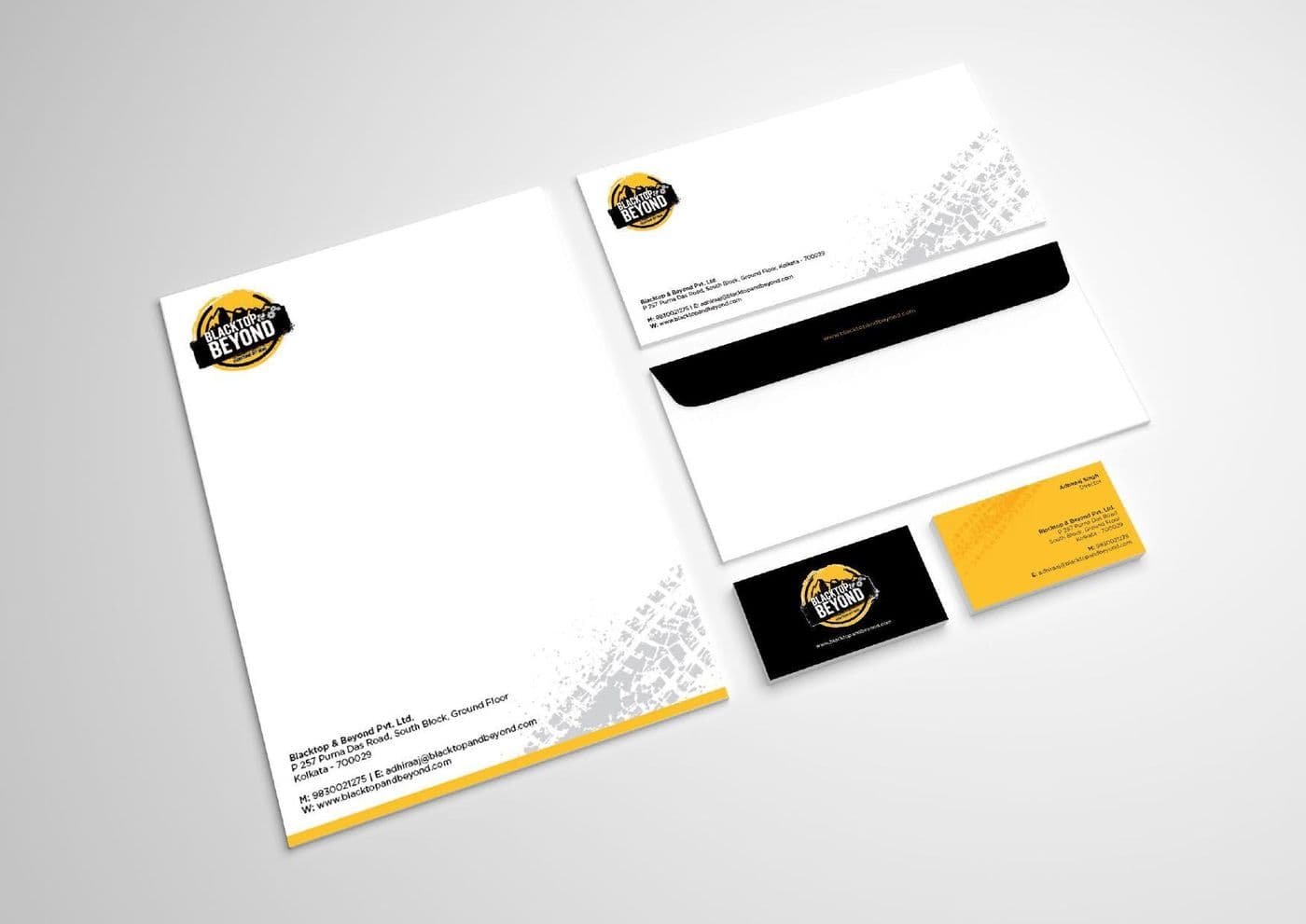
Letterhead, envelope and card built from one grid, so the identity survives being printed by three different vendors.
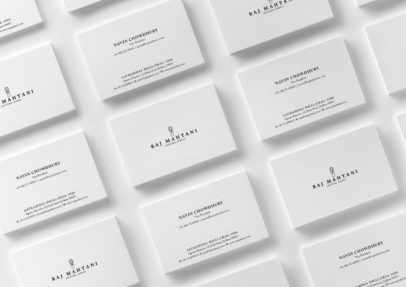
A card layout that holds up across a whole company, with a hierarchy that works for a founder and a field executive alike.
A high-contrast stationery set where the brand colour does the identifying and the type stays functional.
Polar
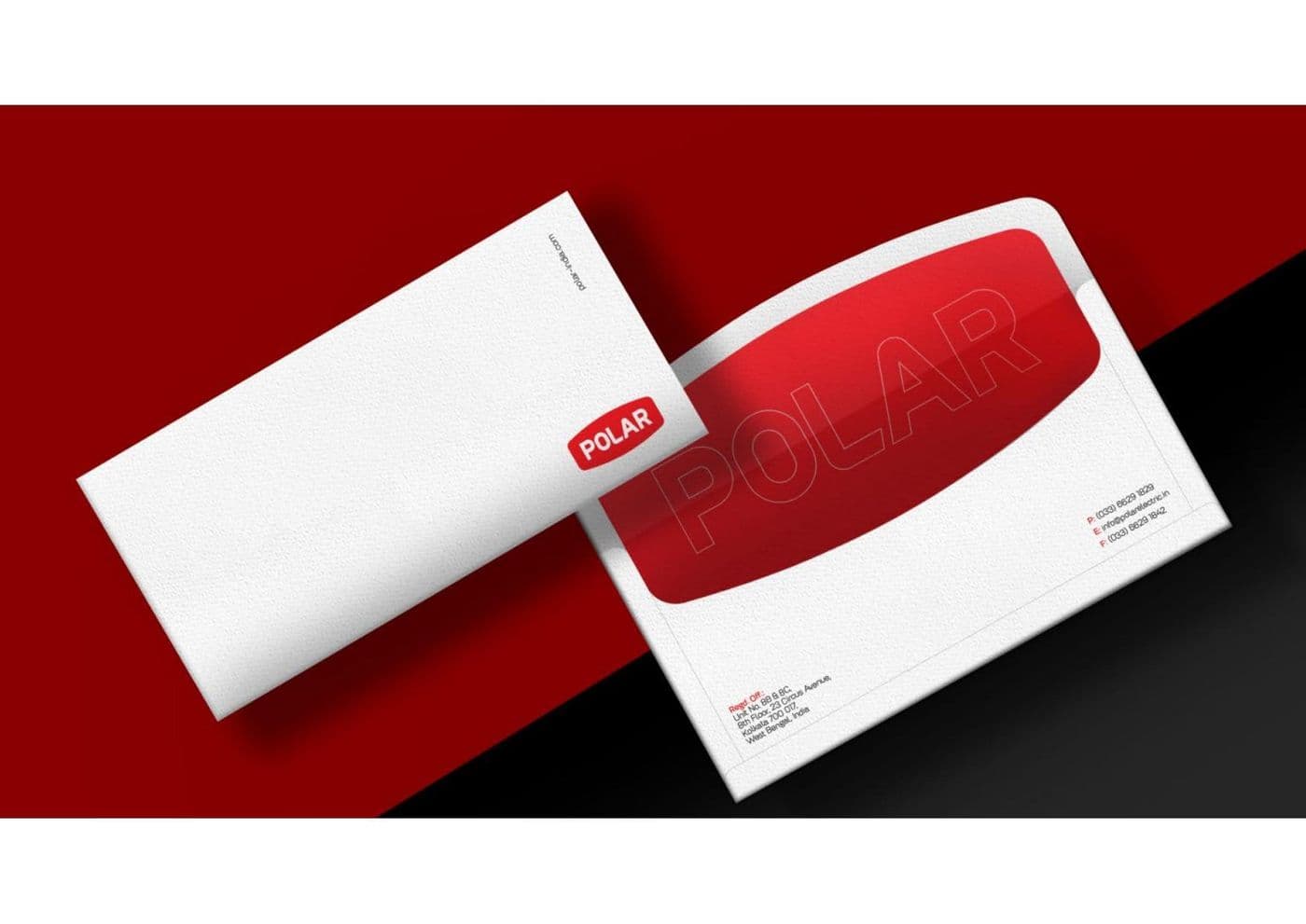
Envelope and collateral for a consumer-durables brand, built so the mark reads at postal scale.
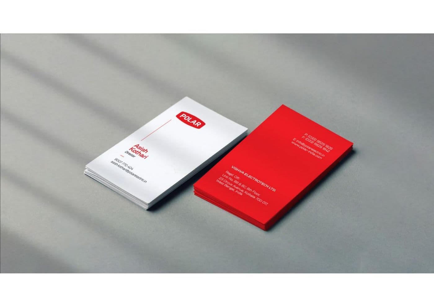
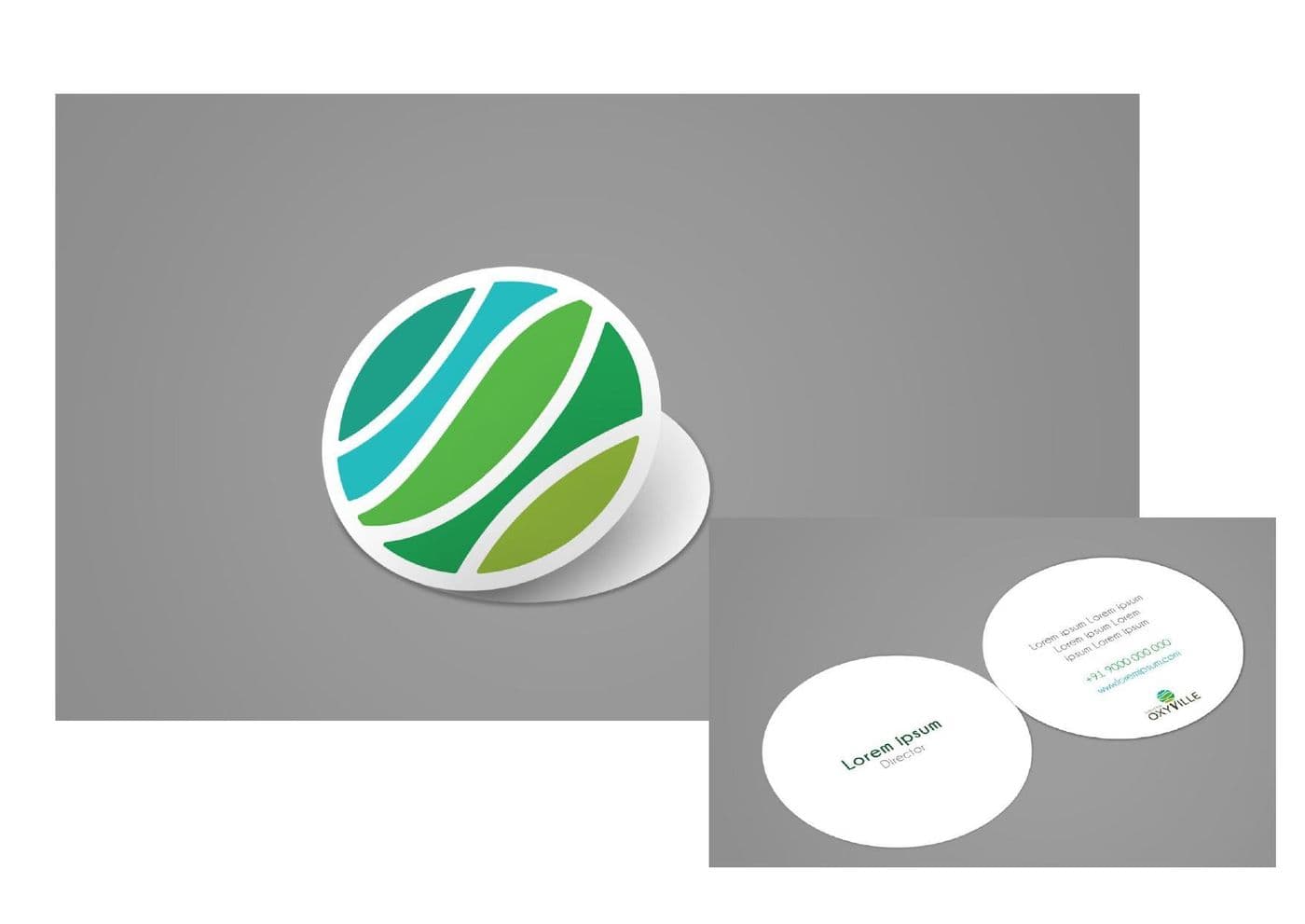
A gradient mark tested against its own business card first, because that is where most marks fall apart.
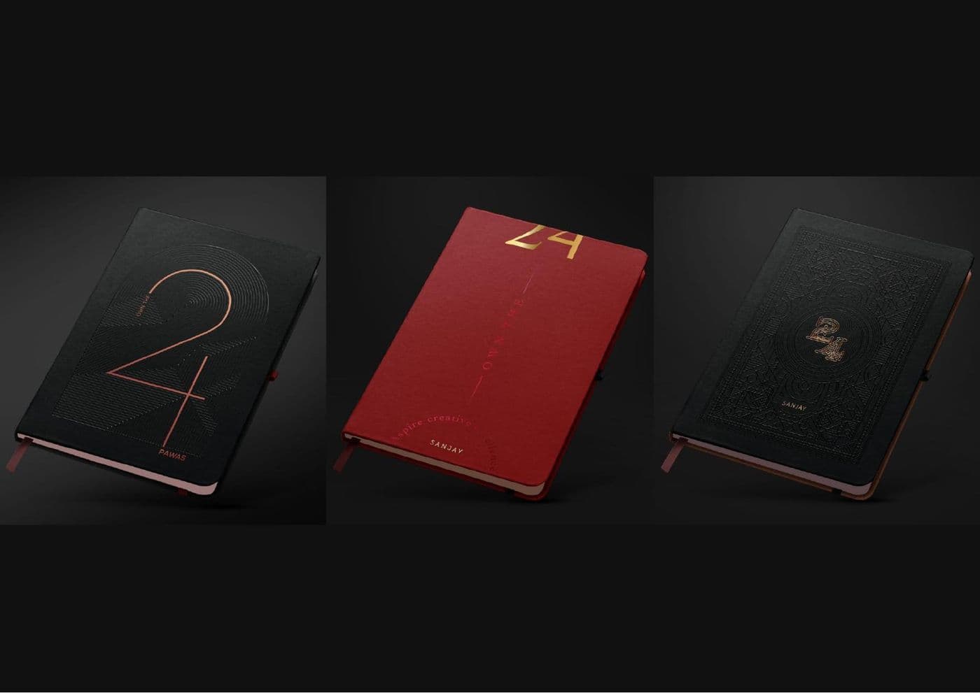
Year-book and diary covers in foil and deboss, where the finish carries the whole design.
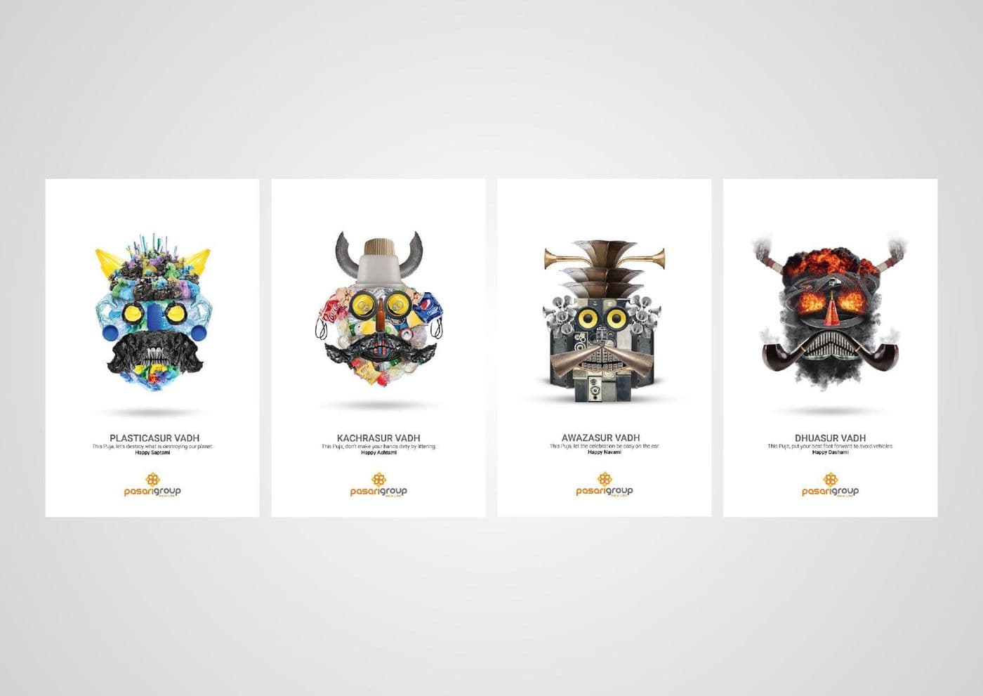
An illustration set built on one construction grid, so four very different characters still read as one family.
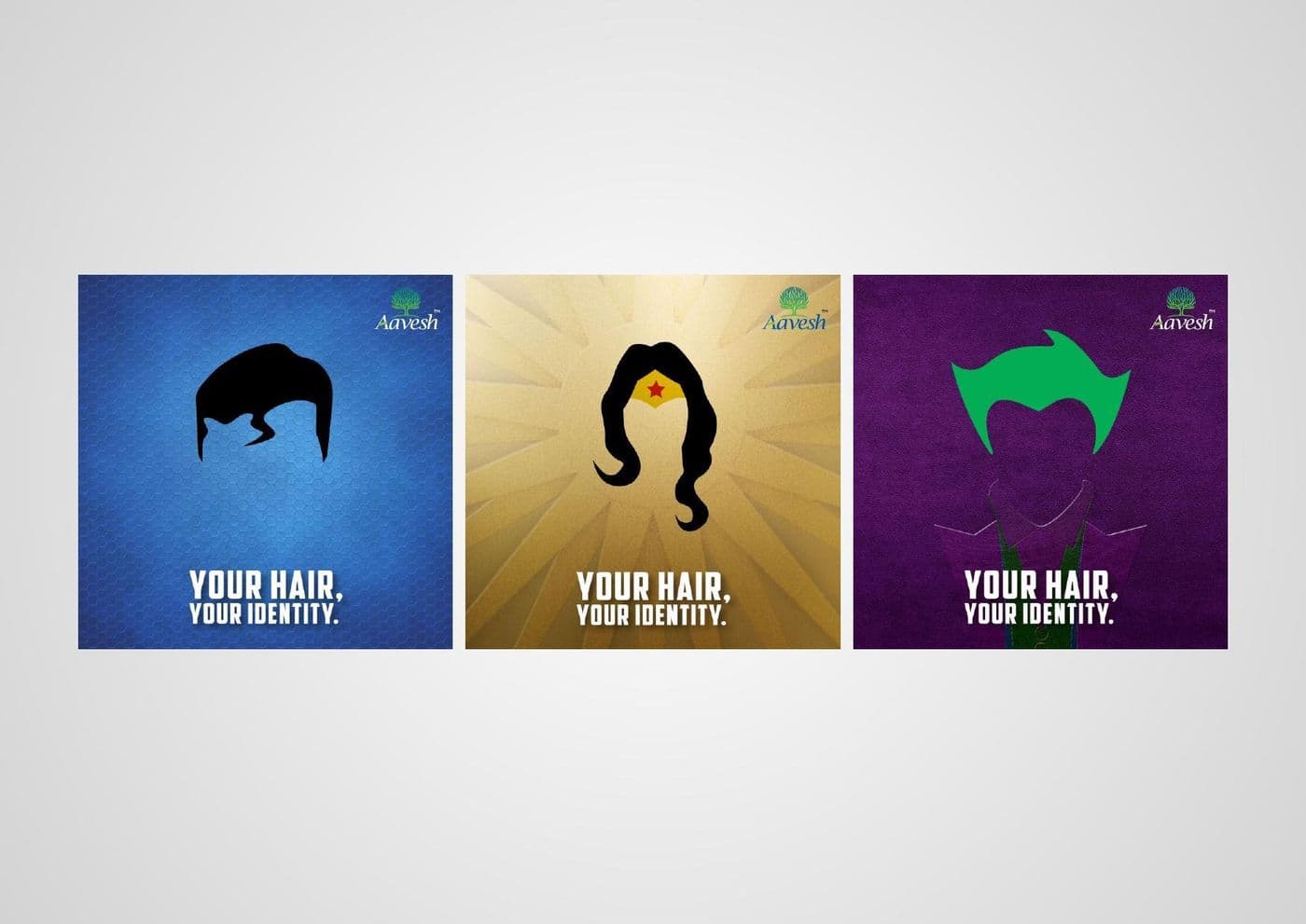
A silhouette-led campaign where the hairstyle is the entire message, so it works without a single product shot.
Polar
A Bengali seasonal run where one product shot is re-lit three ways rather than reshot for each execution.
Polar
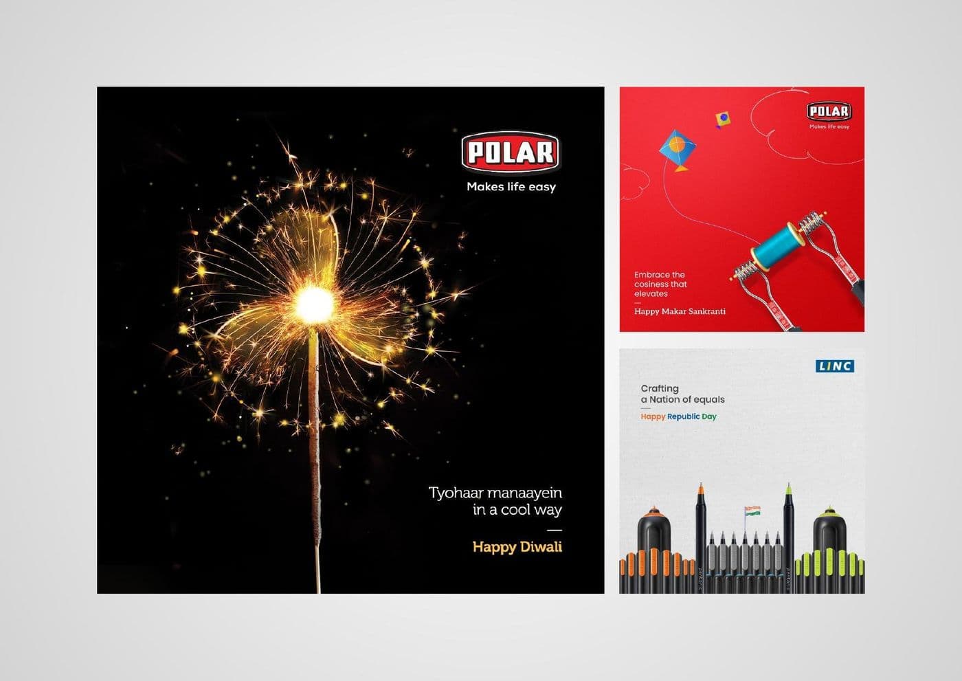
A festive greeting built from a single long-exposure sparkler frame, so the brand appears without shouting over the occasion.
A month of posts designed as a grid rather than as nine separate files, so the feed reads as a composition.
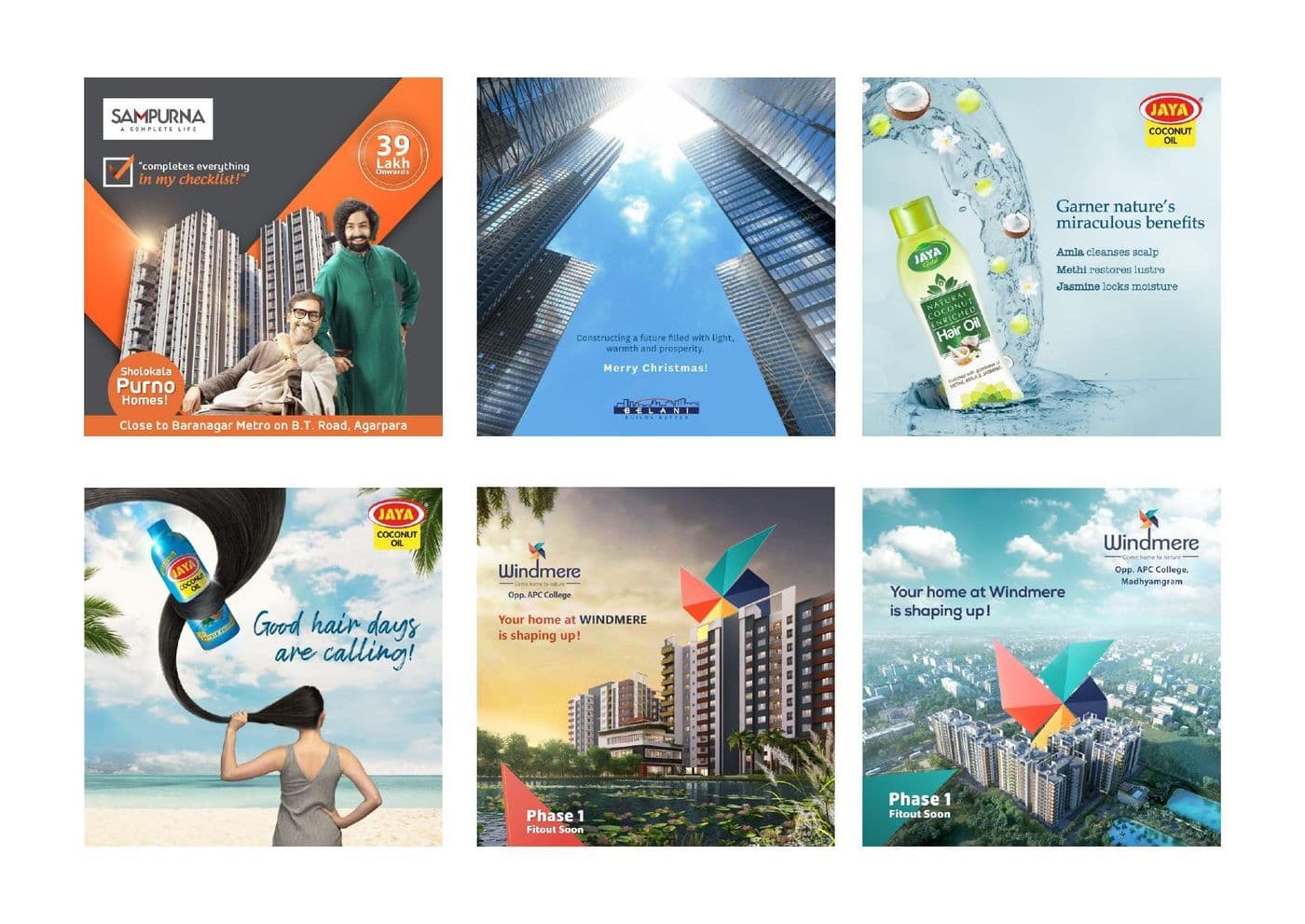
Residential launches and project updates templated, so a new phase becomes a swap rather than a redesign.
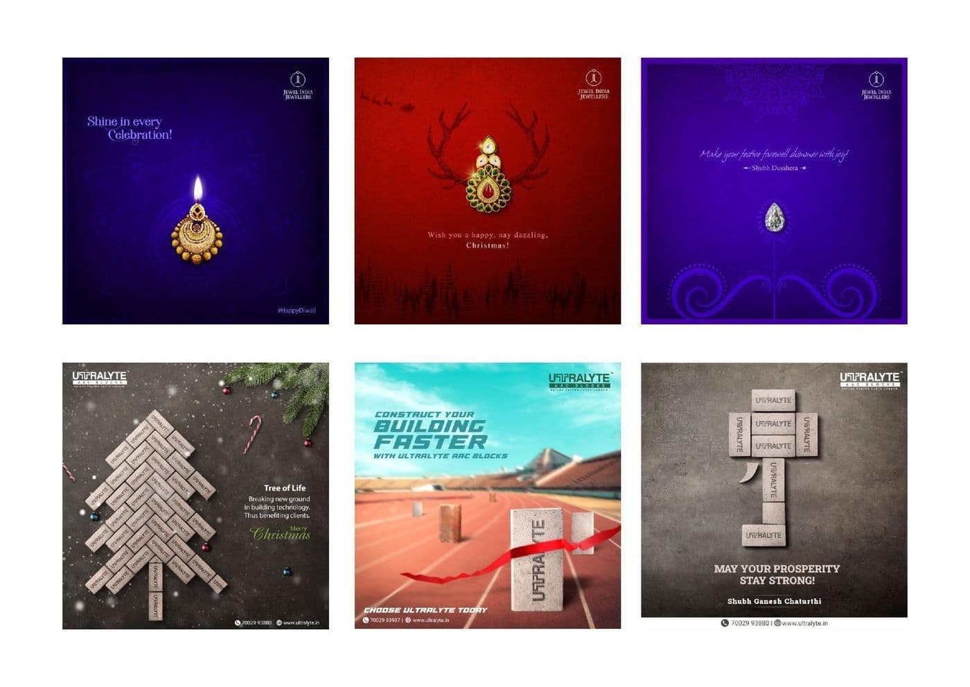
Occasion posts where the brand asset is deliberately small, because a festive greeting that sells reads as an ad.
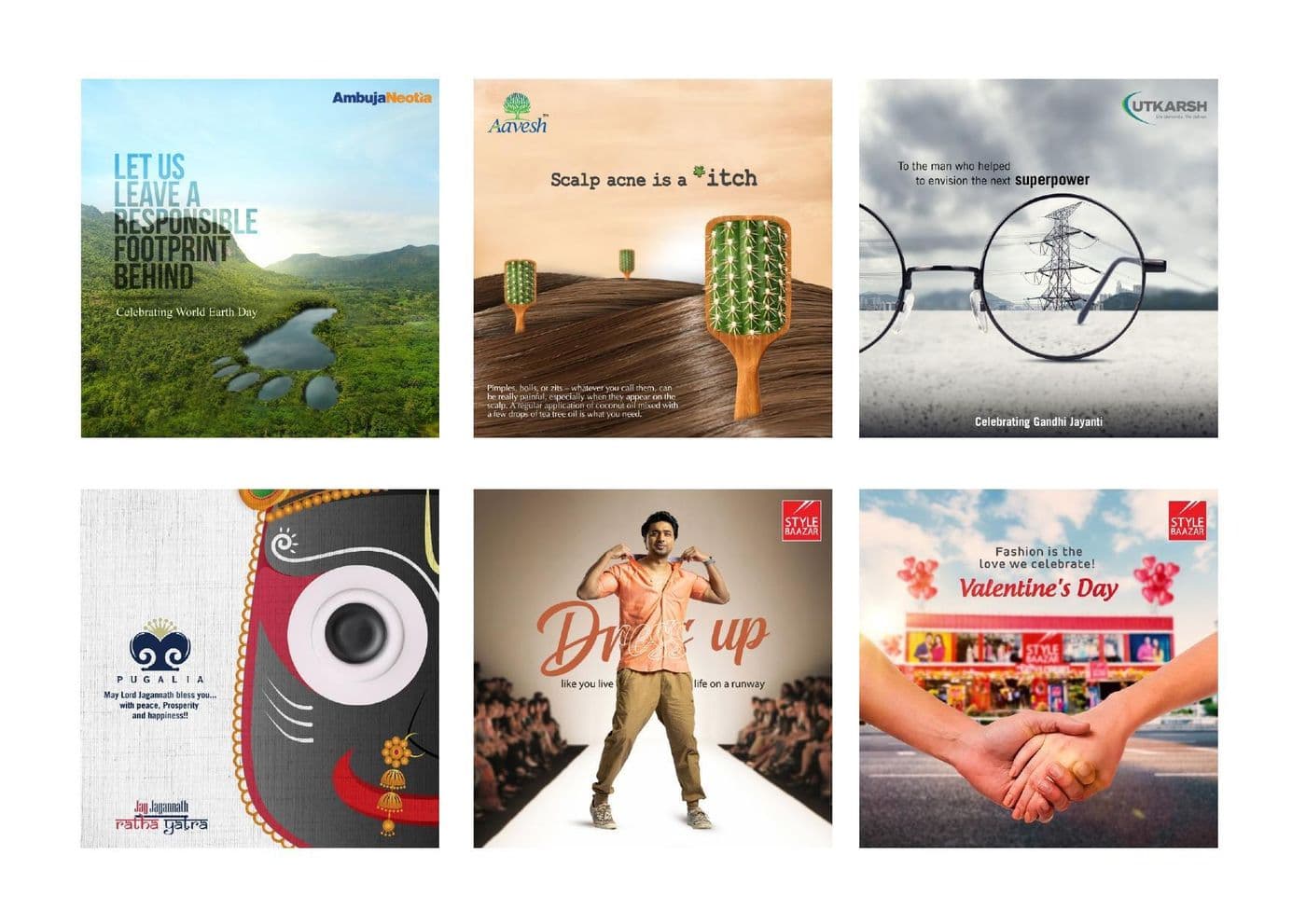
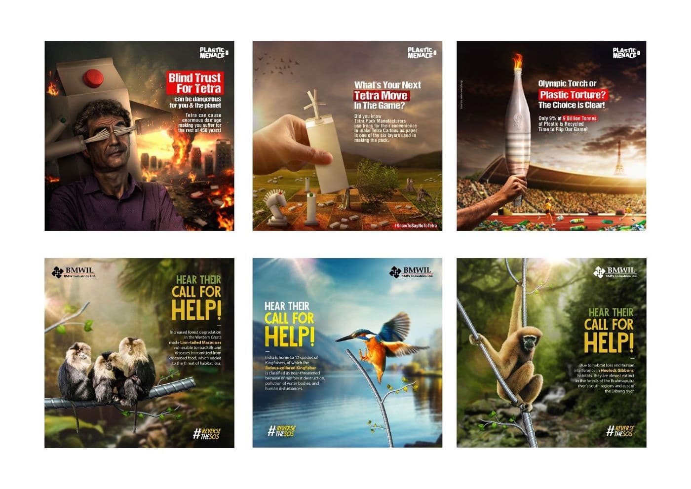
Conservation and awareness posts built on strong single images, with copy short enough to survive a thumb.
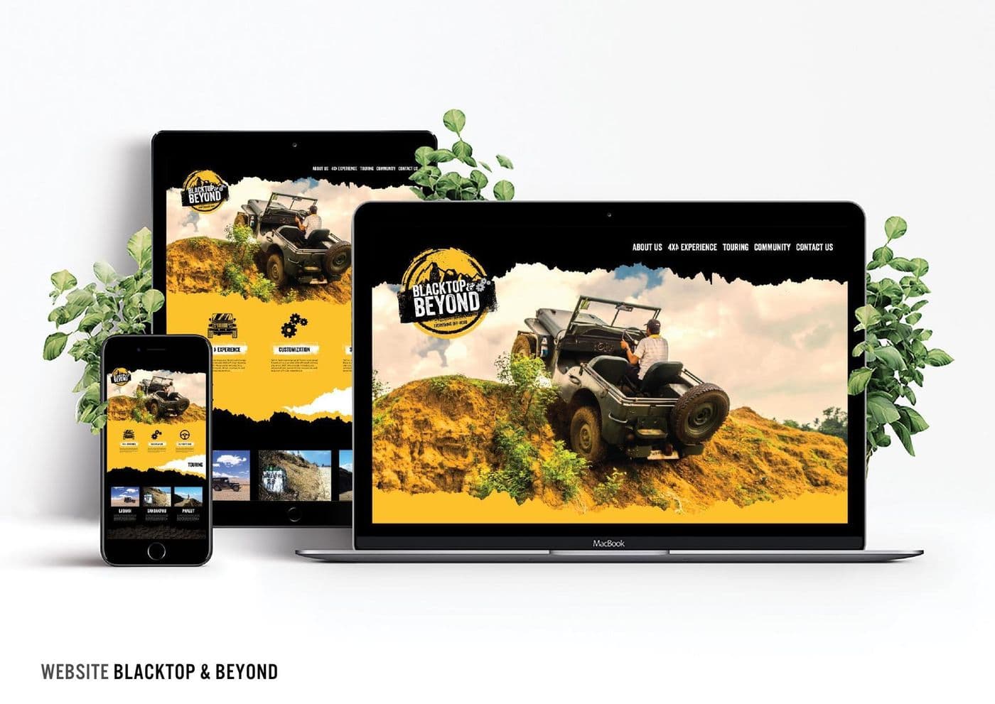
An off-road brand site designed mobile-first, with the hero built to survive a slow connection rather than a showreel.
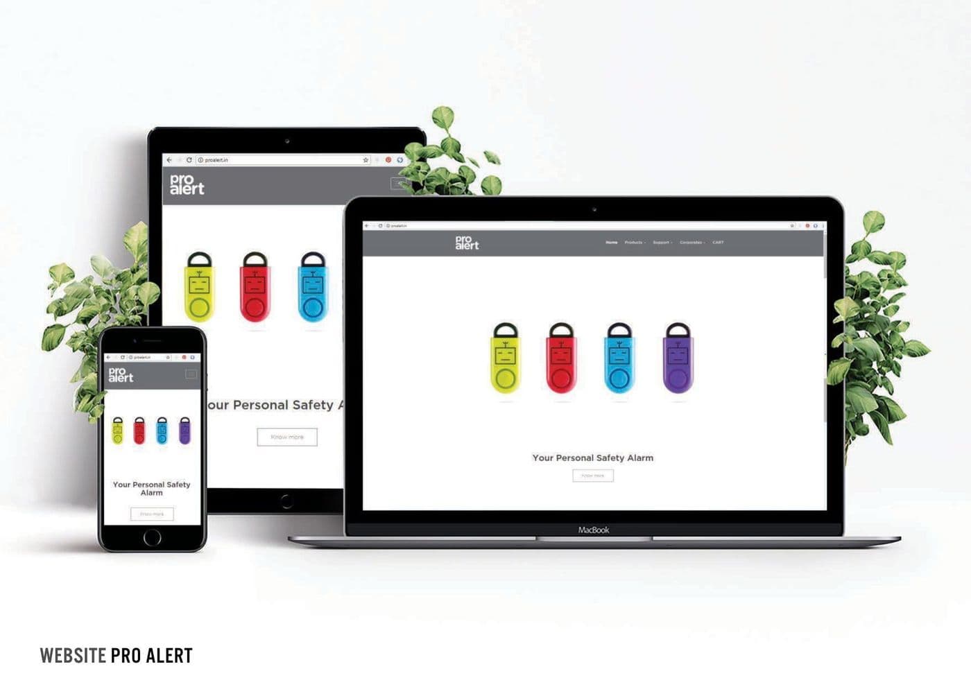
A personal-safety product site where the colourway selector had to work as the primary navigation.
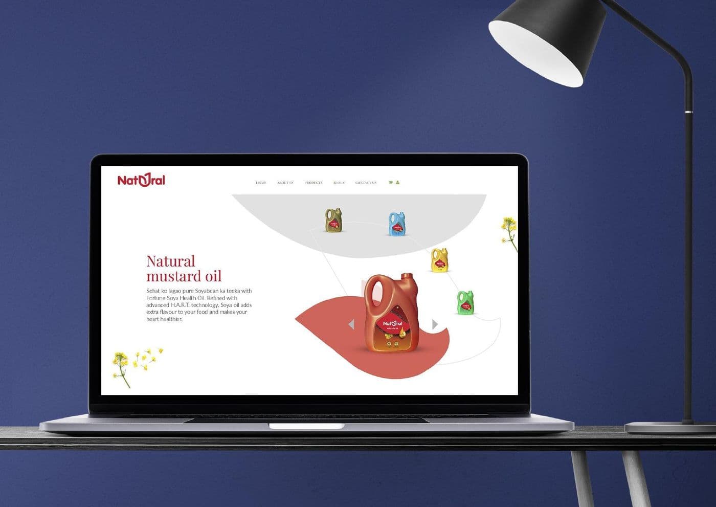
A food brand storefront built around illustration, so provenance carries the page where photography would look generic.
Filter the full gallery by discipline below.
[02] The gallery
6 disciplines across 36 pieces — filter to the one you are hiring for.
36 pieces shown.
Anmol
A Durga Puja gate and pack lockup in Bengali, built so the health claim reads at pandal distance rather than at arm's length.
Sasya
A wearable-art campaign where the garment and the backdrop are the same artwork, so the product cannot be cropped out of its own advertising.
Sasya
The hero frame for the launch, art-directed so a single image could carry outdoor, press and social without a reshoot.
Sasya
The textile prints turned into a brand pattern library, so packaging, signage and social all draw from the same set.
Sasya
A poster run in three colourways, each holding the same lockup so the series reads as one campaign across a shopfront.
Raj Mahtani
A jewellery spread laid out for a glossy, where the typography has to stay quiet enough to let the pieces carry the page.
A full-page property launch built around one open-sky image, because a press ad competing with a newspaper needs air, not features.
Retail press in Bengali, typeset so the offer survives newsprint dot gain and still reads at a glance.
Rajat Primarc
A phase-launch announcement where the price point and the phase number had to be the two things a reader took away.
A sweet-box system in two structures and one palette, designed to stack cleanly on a counter and photograph well on a phone.
PRAN
Masala Muri and Masala Chidwa packs built on one grid, so the range reads as a family on a crowded shelf.
A flavour range differentiated by colour block alone, so a shopper finds the variant without reading a word.
Confectionery packaging where the cutaway product shot does the selling and the type stays out of its way.
A can wrap designed on the cylinder rather than the flat, so the artwork resolves from any angle on shelf.
Product and lifestyle shot as one campaign, so the range and the reason to buy it arrive in the same frame.
A mass-market biscuit wrapper where the only jobs are appetite appeal and legibility at arm's length.
Logotypes drawn in Bengali script, where the letterform has to carry the brand because a Latin fallback will not.
Mark routes explored side by side, so the client chooses a direction rather than reacting to a single option.
Three sibling marks for one group, drawn to sit together on a letterhead without any one shouting over the others.
Letterhead, envelope and card built from one grid, so the identity survives being printed by three different vendors.
A card layout that holds up across a whole company, with a hierarchy that works for a founder and a field executive alike.
A high-contrast stationery set where the brand colour does the identifying and the type stays functional.
Polar
Envelope and collateral for a consumer-durables brand, built so the mark reads at postal scale.
A gradient mark tested against its own business card first, because that is where most marks fall apart.
Year-book and diary covers in foil and deboss, where the finish carries the whole design.
An illustration set built on one construction grid, so four very different characters still read as one family.
A silhouette-led campaign where the hairstyle is the entire message, so it works without a single product shot.
Polar
A Bengali seasonal run where one product shot is re-lit three ways rather than reshot for each execution.
Polar
A festive greeting built from a single long-exposure sparkler frame, so the brand appears without shouting over the occasion.
A month of posts designed as a grid rather than as nine separate files, so the feed reads as a composition.
Residential launches and project updates templated, so a new phase becomes a swap rather than a redesign.
Occasion posts where the brand asset is deliberately small, because a festive greeting that sells reads as an ad.
Conservation and awareness posts built on strong single images, with copy short enough to survive a thumb.
An off-road brand site designed mobile-first, with the hero built to survive a slow connection rather than a showreel.
A personal-safety product site where the colourway selector had to work as the primary navigation.
A food brand storefront built around illustration, so provenance carries the page where photography would look generic.
[03] What the studio makes
The same small team on the Salt Lake floor ships the client work on this page and the SaaS platforms we sell — which is the only reason we can quote a fortnight for something most agencies subcontract.
Marks, wordmarks and the stationery systems that carry them.
Structures and wraps designed to be found on a crowded shelf.
Press, spreads and finishes made for paper, not for a screen.
Key visuals and series built to run across every placement.
Content systems designed as a grid rather than as loose files.
Sites designed mobile-first and built to load on a real connection.
Named where we are free to name them. The rest of the work was delivered through an agency or has not been cleared for attribution, so it is described by what it is instead.
The next step
Send us the problem rather than the spec. You get a scope, a fortnight-by-fortnight plan and a fixed price within five working days — and an honest answer if what you need is a fix, not a rebuild.
First response inside 4 business hours · 15 specialists on one floor in Kolkata